Your Profile Picture Is Not a Style Choice
Your profile picture is not a place to get fancy and cute with the image you use.
It’s providing your audience a chance to earn your trust at a thumbnail size. That might sound a bit over-the-top, but hear me out.
Before someone reads your bio, clicks your website, checks your speaker page, or decides whether or not you belong in the conversation, they see your face in a tiny little circle or square.
That tiny image is doing a ridiculous amount of work. It has to help someone believe what you say is true about the level you operate at.
It has to create enough connection and intrigue to keep them moving.
It has to feel current, credible, and genuine before they have any real context for who you are and what you can do for them.
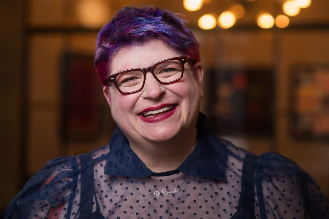
Recently, I was reviewing two images from the same session with a client during a post-session strategy call.
We talked about which photo would best serve as his #1 profile photo. Both were strong contenders. Both said something useful and true about the person in front of the camera. But they did not belong in the same place.
The first image was the clear winner for the profile photo. Not because it was “better” in some paint-by-numbers sense. It doesn’t work like that.
It won because it did the profile photo job faster.
The eye-level, eye contact created direct connection. The upright posture, outfit choice, and location added up to positioning him as a credible professional who’s done this before. The expression was warm and inviting, with calm confidence and presence, without aggressively conveying “pick me” energy. It felt natural. Not like he was putting on a show for the camera.
That’s a big deal.
Authority does not need to jackhammer home the point. You don’t need to put your hands on the end of a long boardroom table, lean forward, and present yourself as a master of the industry.
When the photo works, the authority feels earned. You feel the credibility instantly. The image gives you a clean, honest read on the person. And it minimizes friction. That is what a profile photo is supposed to do.
In seconds.
Now the second image was more dramatic. More shadow, mood, and punch. More presence and texture. It has that “damn, that’s a cool photo that pops” quality.
And that’s exactly why it wasn’t the right fit as a profile picture.
At a larger size, that kind of image can be powerful. But at thumbnail size, the energy changes.
It loses its chance to breathe in a tiny circle or square. The shadow, low angle, posture, and mood can start to overpower the viewer in this format. Instead of connecting with the person, the viewer starts assessing the vibe.
“Is this person too much for me? Are they this intense when they coach/train/speak?”
That’s a problem.
Your profile picture is not the place to make potential clients question your ability to meet them where they are.
If the image feels too dominant, guarded, shadowy, or emotionally loaded in that tiny space, it can slow the viewer down. They may respect it. They may even think the shot looks badass.
But appreciation and connection are not the same thing. For a profile image, connection is the name of the game.
This doesn’t mean the second photo needs to be thrown in the garbage. That image belongs somewhere, just not as a profile shot.
It could work beautifully as a header image for a serious article where you want authority presence more than instant warmth.
It could support a LinkedIn carousel about trust, influence, pressure, or the challenges associated with reinvention.
It could belong in speaker materials, presentation slides with text, program descriptions, case study hero sections, or landing pages where the image has room to breathe and the mood supports the message.
That’s the part most experts miss. They look at two good photos and ask, “Which one do I like better?” Wrong question.
The better question is, “What job does this photo need to do?”
Use the profile photo for connection and credibility. Use the dominant frame for a more emotional punch when it serves the message across your visual ecosystem.
Both images belong in your visual authority library. But only one of them should be carrying the weight of your first impression in a tiny circle next to your name.
So before you choose a profile photo because it looks cool, dramatic, creative, polished, or different, ask yourself three questions:
Does this image subconsciously convey my authority in 1-2 seconds?
Does this image convey approachability and warmth?
Does the expression invite trust?
When your face gets reduced to thumbnail size, the little things become big things. And if the photo makes them hesitate, they’re going to keep scrolling to find someone more inviting.
If you’re not sure whether your current profile photo is creating invitation or friction, start with the 10-Second Visual Authority Scan. It will help you look at your visual presence the way people already do: quickly, instinctively, and before they ever read a word.
Take the scan here: johndemato.com/newsletter-signup