
The Right Hero Image Sells the Room Before Your Copy Does
When you’re building a services page for a recurring mastermind, the hero image at the top of the page has a bigger job than most people realize.
It’s not there to make the page look pretty.
It’s not there because you had a nice portrait from your last branding session and needed somewhere to park it so it gets used.
The hero image has to help the right-fit person visualize being in that room before they decide whether or not they want to be in it.
That matters because a mastermind is not just a service.
It’s an environment… and a commitment.
It’s a promise that if someone shows up, sits down, opens the workbook, listens, speaks, thinks, and participates, something will change for the better in their own life.
So the question is not, “Which photo looks the best?”
It’s, “What does this page need the buyer to believe first?”
If the goal of the page is to get butts in seats every month, quarter, or twice a year, the hero image needs to perform a different job than a squeaky-clean headshot or portrait.
Those are core assets, and their job is to introduce you to those you serve.
A service page hero image needs to help people understand the experience they’re stepping into.
That means the right image depends on what belief you want to land first.
And there is no one right way to do it. It depends on what you want to accomplish most in those first few seconds someone lands on that page.
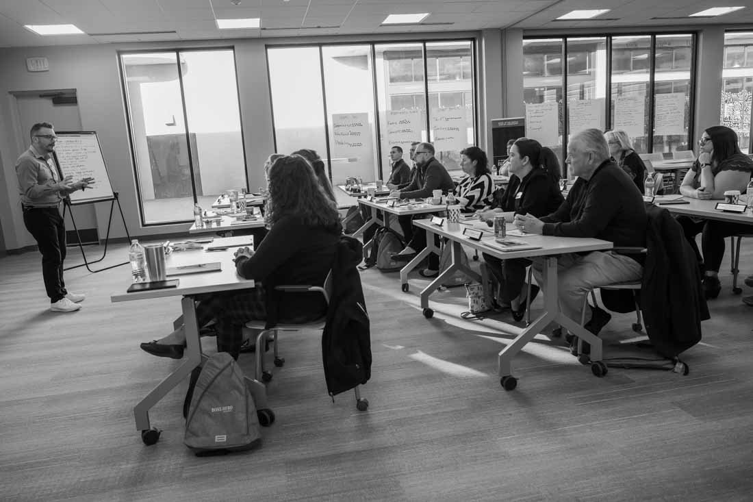
If you use a wide shot of the room, you’re selling the environment.
You are showing scale, energy, attention, and social proof. The viewer can see that this is a real room with real business leaders already inside it. They can start to answer the quiet question every potential buyer has in the back of their mind: “Are these my people?”
That kind of image is often the strongest default hero for a mastermind page because it sells the room first. And in a recurring mastermind, the room is the product just as much as the curriculum.
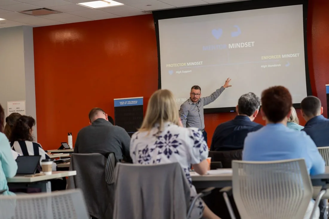
If you use a photo of the expert working closely with participants, you’re selling access.

That image says, “You’re not just a seat filler here.” It shows proximity and hands-on leadership. It proves that the person leading the room is not just performing while everyone else sits there hoping they catch a useful idea or two.
For a buyer who wants to be seen, challenged, coached, and worked with directly, that photo does a lot of heavy lifting.
If you use a photo of the expert writing on a whiteboard or flipchart, you’re selling process.

That image says, “There is a method here.” It shows ideas being captured, organized, and turned into something people can actually understand and use.
Unlike some mastermind services pages, where lots of big promises, “high-level room” language, and vague transformation talk are projected, a flipchart photo cuts through some of that.
It says there is structure and roll-up-your-sleeves facilitation. There is a pathway through the confusion that helps you become better on the other side of the experience.
If you use a photo of a participant taking notes in a workbook, you are selling participation.

That image, while less flashy than the others, should not be slept on.
It says people are not just sitting there nodding along while someone pontificates at them for hours.
They’re processing, writing, asking questions and making decisions, ultimately translating the experience into action.
That photo signals the visible steps that lead to transformation. It also makes the experience feel more real.
A workbook says there is a curriculum, exercises, and something to take with you after the experience is over (hopefully NOT to be put on a shelf and ignored forever).
None of these photos are “better” or “worse” than the other. They are better based on what you want them to achieve during the initial scan of the page.
You choose the image based on the first belief you want the buyer to have.
And, the photos that don’t become the hero image still matter. They can live farther down the page, next to the copy they support.
The close interaction photo can sit near the section about direct coaching. The flipchart photo can support the section about your process. The workbook photo can reinforce the part about implementation.
That is the point. These images are not competing with each other - they’re doing different jobs.
A services page is not just explaining what you offer. It’s helping someone picture themselves inside the experience before they ever click the button to sign up.
And if the image at the top of the page cannot do that, it’s not carrying its weight.
If you are not sure whether your current visuals are creating clarity or friction, start with the 10-Second Visual Authority Scan.
It will help you look at your visual presence the way people already do: quickly, instinctively, and before they ever read a word.
Take the scan here: johndemato.com/newsletter-signup