A Great Photo Can Still Be a Pain in the Ass to Use
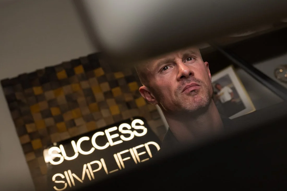
"Those photos aren't gonna work. They're vertical and we need horizontal, which sucks, because I like how you look in them."
I said that during a recent Quick Fix session with an expert, and it wasn't the only time the same problem came up.
The photographs themselves were good. Strong expression, genuine body language, the right activity happening in the frame. But once they needed to live inside an actual website layout, most of them became nearly impossible to use.
One needed more room on the side for copy. Another was framed too tightly. One had the right moment, but the composition didn't match the space available on the page.
None of that makes them bad photographs. It makes them hard to use.
That difference matters, because your photos don't spend their lives sitting in a folder looking pretty. Eventually somebody has to do something with them. A designer builds a page. A marketer makes a graphic. Somebody needs a speaker one-sheet, a presentation slide, an article thumbnail, a social post, or whatever the business has to produce next.
Ideally, the images plug into those situations without anybody having to perform open heart surgery on them.
When they can't, the creative on the other end is cropping more than they planned to, cutting you out of the frame, moving things around, extending backgrounds, adding gradients, or settling for a different photo simply because it physically fits.
They're squeezing water from a rock.
That burns time, adds revisions, and usually produces a version of the finished piece that isn't exactly what they had in their head to begin with. So the work ships, and it lands at good enough.
Here's the problem with that.
When the finished materials keep landing at good enough while the actual business is operating at a much higher level, the visual signal starts drifting away from the reality of who you are and how you help people.
Nobody ever came to that conclusion consciously. It just happens, one workaround at a time.
Which is why visual variety is such a big part of building a visual library that's worth having.
And by variety, I don't mean handing someone 315 photos that are basically photocopies of 20 different photographs. If someone shoots you in essentially the same spot, from roughly the same distance, with the same emotional sentiment and body language, pressing the shutter another 25 times doesn't create more options. It just takes up more room on your hard drive.
And it's the photographer's fault, not yours.
Most of that flexibility gets decided before anybody picks up a camera.
The location either gives you walls, depth, and open space to work with, or it doesn't. A room with one good corner is going to produce a library with one good composition in it, no matter how well the session goes.
Then during the session, the job is to keep creating options inside what the room gives you. The person moves around the frame. Sometimes the environment needs room to breathe through a wider shot. Other times I get closer, because the expression, the hands, or a detail matters more than the context surrounding it.
The activity, emotion, and relationship to the camera change from shot to shot.
The goal isn't to photograph everything under the sun until everybody taps out from exhaustion. There's a finite amount of time, and the priorities are still the priorities.
The shot sheet establishes what absolutely needs to be captured with a professional lens. Once those are covered, the nice-to-haves get their turn if there's room.
Because the objective isn't maximum variety so you can say you have a lot of photos. It's useful variety.
There’s enough range that you and the creatives supporting your business have something to work with when something needs to get made.
And not all of it needs professional camera time. If something happens naturally in your day-to-day and doesn't require lighting, direction, controlled production, or a recreated scenario, it doesn't always need an expensive camera pointed at it. Save the session for the images that actually benefit from having a professional photographer in the room.
A great photograph can still be a great photograph and not give the person on your team enough room to do anything with it.
That's why, during a session, I'm not only thinking about what looks good through the viewfinder. I'm thinking about people who aren't in the conversation yet.
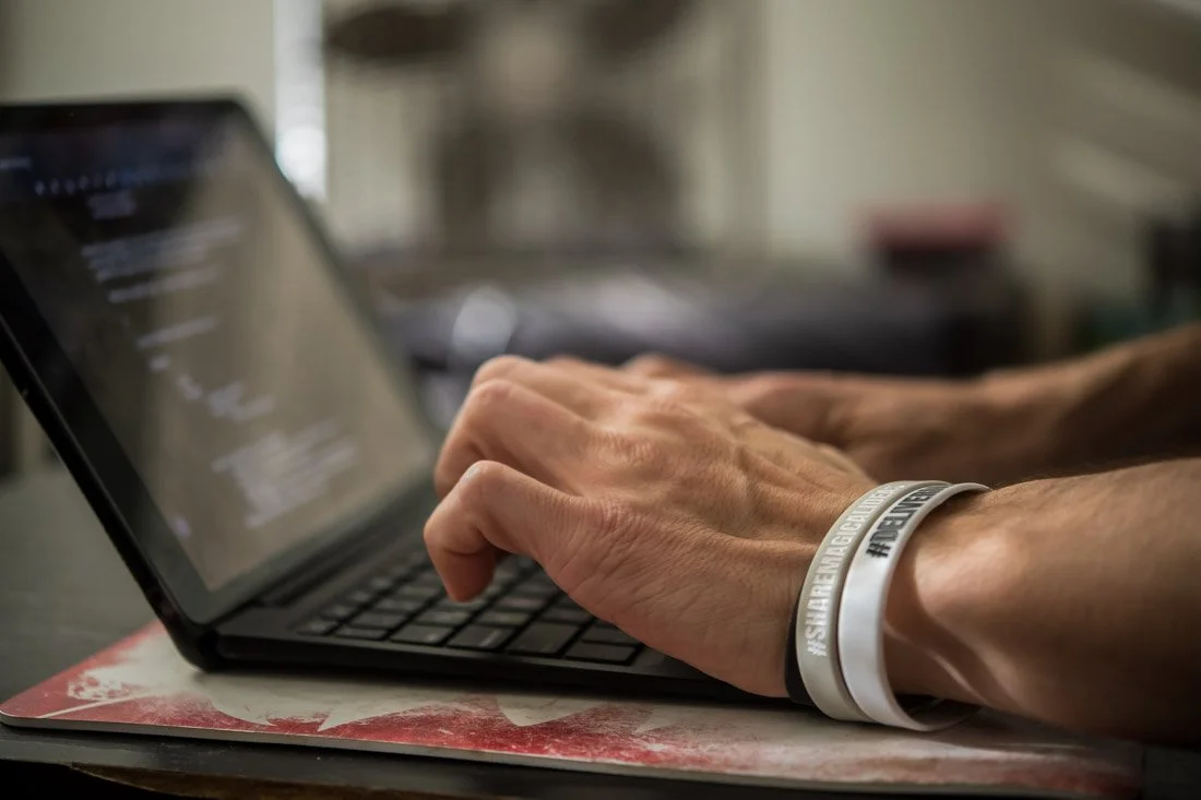
The website designer, six months from now, who needs you sitting and smiling with enough empty space on the left to drop a headline into. The marketer who needs room around your hands while you're typing, because the copy has to sit somewhere. The graphic designer who needs your shoulders intact, because the one-sheet calls for you centered and there's nothing to be done if the composition already cut you off.
None of those people are ever going to ask me for anything. They'll open the folder and either find what they need or start working around what isn't there.
If you're looking at your current photos and everything requires a workaround before it can actually get used, let's talk.
We can figure out what your library gives you now, where the friction keeps showing up, and what needs to be created next: https://johndemato.com/contact