
Spoiler Alert: There Is No Money Shot
For the first few years of building my business, I treated my website galleries like I was building a greatest-hits catalog.
I’d go back through thousands of photos from different sessions and events looking for the ones that popped the most.
The packed ballroom. The killer expression. The dramatic lighting. The photograph that made me stop scrolling and think, “Yep. That’s the one.”
In other words, I was looking for money shots.
This made all the sense in the world at the time. If I wanted someone to hire me as their photographer, why wouldn’t I show them the most “impressive” photographs I created, right?
Well, here’s the thing…
The problem was that I was making those decisions without the bigger picture in mind. They were created without proper context.
I was picking individual photographs I loved, hoping the collection somehow convinced the right person to schedule a call with me.
More reps with actual clients eventually changed the way I looked at all of this.
I realized that the visuals needed to work together, because they’re not evaluated one at a time.
If I wanted to show an example of an expert brainstorming ideas with a pen and notebook, I didn’t need 6 versions of the same image with 6 different experts.
I just needed one expert with 6 different photos of them engaged in that activity.
I could start with a wider shot that established the environment, move closer to show the person actually working, shift the composition so they appeared on different sides of the frame, get tighter on the pen, and eventually show the words written on the page.
Now I had a beginning, middle and end. I had visual variety.
More importantly, it showcased the options that experts could use in their own materials.
One of those photographs might work beautifully across the top of a webpage because there’s room for copy beside the expert. Another could sit next to a story about the thinking process behind their work. The close-up of the notebook might help punctuate an idea about preparation. A different image from the same sequence could become useful three months later for something none of us were even thinking about when the photograph was created.
My own experience changed the way I communicate the value of capturing a wealth of variety during a session to those I serve.
That is, the value and usefulness of the photograph depends on what they’re making at that moment.
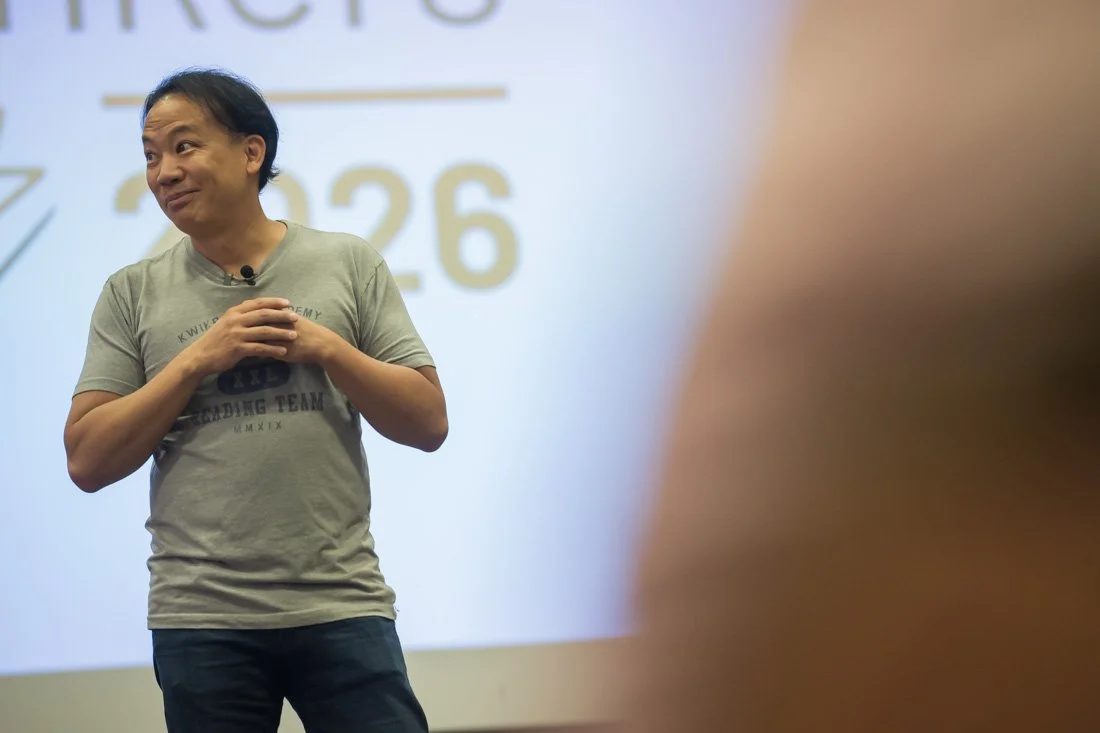
Take one of the photographs everybody loves from a speaking event: the super wide shot of the room.
Packed room. Beautiful stage. IMAG screens. Lights. Smoke machines. The whole nine yards, right? The speaker is right in the middle of it all doing their thing.
That photograph is fantastic evidence of them able to carry their message in a big room. Good.
If you’re trying to show a meeting planner the caliber of rooms you work in, there it is. Put it across the top of a speaker page and suddenly that person can picture you in front of their people.
Now imagine the same speaker is writing an article about empathy.
You think a wide shot of them looking like a tiny peanut in the middle of a 2,000-seat room is going to complement that type of story? Nope.
They need to show their face. The engaged eyes, eyebrows, and mouth. The movement in their arms and body.
In this context, the wide shot is a bad choice to pair with this story. It doesn’t give them what they need for this particular asset they’re creating around empathy.
And this is where people get themselves into trouble when they start reviewing their own photos. The first question is usually some version of:
“Do I look good in this one?”
And I get it. The image does need to pass muster in certain respects.
If your mouth is doing something weird, the photograph is out of focus, your eyes are closed or you simply don’t look like yourself, we’re not conducting a therapy session as to why you need to like this picture.
It’s gone.
But once the visual clears that prerequisite, staring at your left eye and wondering why it looks slightly smaller than your right one isn’t helping very much.
Neither is obsessing over your waistline, your wrinkles or whatever other piece of yourself your brain likes to torture you with on a daily basis when you look in the mirror.
This is what you look like. Own it, warts and all. Because that matters more than people realize.
Think about the last time you knew somebody only through their profile photo and then met them in person. If your first thought was, “Wait, who the hell is that?” How did that make you feel?
Probably not more trusting.
Something feels off because the visual evidence you saw and the person standing in front of you don’t match. And that leads to a pause, and some questions in your mind about that person, and none of them are necessarily going to lead to a positive outcome for them.
Decision makers evaluating you feel that disconnect, too.
So yes, looking like yourself matters. Technical quality matters. Getting a YES to those questions gets the image into consideration for your visual presence.
But then the actual work starts.
What are you making?
What are you trying to communicate?
What do you need the visuals to help someone understand, feel or recognize?
What words are sitting beside the visual?
What other images are around it?
What does the layout physically allow you to use?
What kind of evidence would actually help the person looking at this?
Those questions completely change the way you evaluate your image library. They also change the way you think about creating new photos.
I don’t walk into a branding session looking to create one heroic image that somehow carries the entire investment on its back. We capture enough meaningful variety that the client has options later.
Wide and tight. Looking into the camera and not looking into the camera. Different expressions. Different activities. Different compositions. Different moments within the work. The environments, tools, people and little details that actually belong in their world.
Because I have no idea what they’re going to need six months from now.
And neither do they.
That’s the whole point of creating flexibility.
And when a new need eventually pops up, they don’t start by asking which photograph is the winner.
They look at what they’re making, go into the library, and figure out which available image, combination of images or sequence gives them the most useful material for that moment.
Sometimes the obvious favorite works beautifully. Sometimes the photograph they’ve barely noticed for two years suddenly becomes exactly what they need. Sometimes there isn’t a great option, and now they’ve learned something useful about what to capture next.
That’s why I stopped believing in the money shot.
One photograph in isolation isn’t responsible for convincing people that you’re credible, relevant, interesting, experienced and worth a conversation.
Your body of visual evidence does that over time.
The opportunity is to build enough of it, organize it well enough to actually find what you have, and then evaluate those photographs based on the thing sitting in front of you right now.
Because the best photograph in your library isn’t always the visual you need today.